Decorating with these colors can actually stress you out
Here's what to use instead, according to an expert.
Products are chosen independently by our editors. Purchases made through our links may earn us a commission.
There are a lot of things that stress me out: slow drivers in the left lane, going through airport security, and wondering who's going to get the last rose on the Bachelor every week. And now, according to one designer, I can add paint colors to that ever-growing list.
In an interview with Real Simple, a lead stylist from Overstock revealed the colors that can stress you out if you use them to decorate your home. We asked our own expert, major appliance and home design editor Cindy Bailen, to weigh in with her top tips for choosing hues below.
What are the stress-causing colors I should avoid?
The Overstock designer, Amber Dunford, says that bold, bright colors—particularly red—aren't exactly soothing to the senses. That's because, based on color psychology, these hues are very energizing and stimulating (they even increase your heart rate), which is great in small doses but not when they're wall-to-wall in your home. Using a lot of red or other bold colors can lead to overstimulation and, you guessed it, stress.
Another non-calming color is bright white, which may come as a surprise. While Dunford explains that neutrals often relieve stress, too much of them (especially white) does the opposite.
How can I use bright colors in my home correctly?
If you love fire engine red and sunshine yellow, fear not—you don't have to give them up completely. You just have to incorporate them sparingly and consistently. "Color should always walk through a home," says Cindy, who recommends a limited color palette with pops of an accent color. "Keeping the undertones consistent is essential. Every room in a home doesn't need to be a different color."
And as for white? Cindy personally opts for another neutral instead. "As an architectural color designer, I find white walls to be depressing," she explains. "Pale gray is a better background."
What are the best calming colors to decorate with?

Ahh, so soothing.
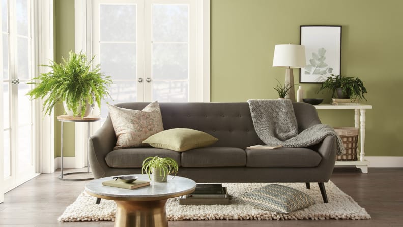
Think more cool, less warm when it comes to your hues. "For most people, cool colors are calming," Cindy says. "That explains why many of the paint companies are promoting blues and greens as colors of the year." In fact, Behr recently announced that their 2020 color of the year is Back to Nature, a sage green shade.
Because green is such a prevalent color in nature, it tends to make us feel more peaceful and symbolizes growth and harmony. You can use it as a wall color or incorporate it in more subtle ways, like with pretty throw pillows or a statement side table. Another easy way to go green? Add more houseplants to your decor. Your space will not only feel instantly calmer but it will look brighter and warmer, too.


