These colors will be insanely popular in 2019—here's how to use them
Wake up your home with the 2019 Colors of the Year.
 Credit:
Dunn-Edwards
Products are chosen independently by our editors. Purchases made through our links may earn us a commission.
If you’re looking to paint your place in the near future, you don’t have to reach for white or pastels. The pendulum has swung, and the hottest colors for 2019 are warm, earthy and jewel-like. Any of them will make your favorite room look gorgeous. Think dark green, cool blue, warm copper, soft coral—colors you may never have thought of now take center stage. Beautiful, right, but what do you do with them? Keep reading—I'll give you some ideas.
Always test paint color first. Some of your favorite paint companies now sell paint and color samples online. Some brands will send you a sample pot. This is helpful for many reasons—convenience, of course. But what’s more important, making a sample board lets you test color under your own home’s lighting conditions, which are so much different from any paint store’s. Even your appliance colors (black stainless steel, anyone?) can influence your color choices!
As an architectural color designer (AKA: home color geek), I applaud the return of color, and I hope you do, too. Here are the beautiful shades you should look for in 2019 and how to use them to wake up your home.
Living Coral by Pantone—use with warm colors and warm metals
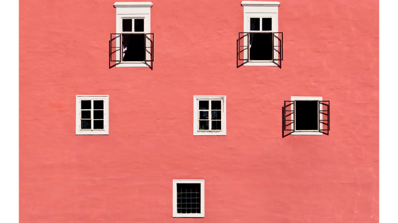
Living Coral is a gorgeous shade to use in your home], a golden member of the orange family with a soft edge. Pantone, the company that proclaims itself the color authority, says this color reaches out to embrace you.
Last year's pick, Ultra Violet, explored the cosmos. This year's Living Coral reminds us to look to nature in the ocean. You've seen this color in the sky, too, at sunrise and sunset. Pillows, rugs, or curtains that highlight this hue will definitely liven up a bland couch or bedroom. Or get really playful, and paint it on an accent wall. Pair with: Every other warm color, and any shade of cool green or blue will make Living Coral look even more vibrant. Rose gold really complements this coral, so add a few metal accents in a room with Living Coral—it's like jewelry for your space.
Blueprint by Behr—use with other heavenly blues
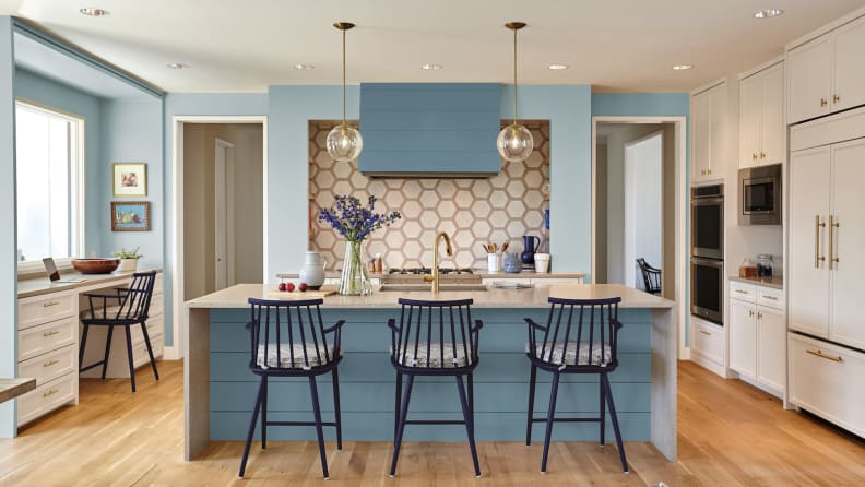
A color you can probably find a wall for right now, Blueprint is a mid-tone, overcast blue that’s as comfortable as a favorite sweater. We’re picturing this blue, with its light touch of teal, on kitchen cabinets, bedroom walls, and ocean waves (jk, but you’ll see it there.) Imagine Blueprint on the inside or outside your house—it’s pure heaven. Pair with: Other blues will work beautifully with this shade, and you can work in neutral earth tones, and jewel tones, too.
Night Watch by PPG—use with neutrals and warm or cool metallics
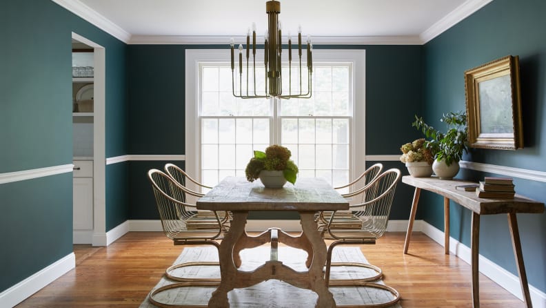
Dark green is luxurious and restorative. PPG’s choice, Night Watch, brings the relaxing power of nature into the home. It has a little bit of blue in the undertone, so Night Watch comes across as a deep evergreen. And if a room with four walls of this dark green is too much for you, use it on a focal wall. You can also brush a couple of glossy coats on your front door, stand back, and wait for compliments to roll in. Pair with: Black and greige (a gray and beige combo) will keep the drama going, and metallic accents add shine.
Garden Patch by Dutch Boy—use with soft neutrals or floral tones
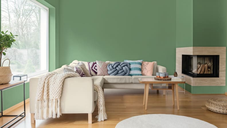
Dutch Boy also offers a green hue, Garden Patch, as its color of the year. This one is a lighter, tranquil, optimistic shade straight from the garden or the succulent bowl. It’s fresh and cheerful, and you can use it in a kitchen, family space, or kid’s room with equal success. It brings the outdoors in, even if the room has no view Pair with: Soft neutrals and bright pink accents evoke a flower garden's leaves and blossoms.
Cavern Clay by Sherwin-Williams—use with other desert shades
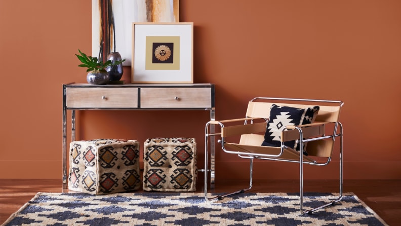
It’s been too many years since the last time terracotta was in style, but it’s definitely back now. Sherwin-Williams Cavern Clay is reminiscent of the desert southwest, and it will bring warmth to a home in any geography. This color is 1970s retro, down to earth (literally), free-spirited, and bohemian, In short, endearing. If you’re adventurous, this is the color to use in your living room. Pair with: Taupe, blue-gray, black, and tan extend the western flair.
Metropolitan by Benjamin Moore—use with other classic colors
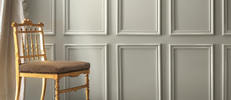
If your room calls out for a sophisticated hue, use this cool, lustrous gray. Benjamin Moore’s Metropolitan is ever-classic, perfect for a sleek, contemporary kitchen, a dreamy, relaxing bedroom, or a spa-like bath. Actually, it works beautifully in every room of the house. Pair with: Classic navy blue, charcoal, and dark green work equally well to contrast with this neutral.
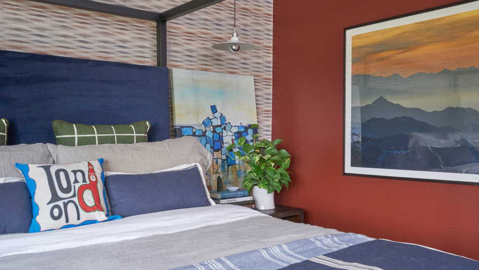
Spice of Life by Dunn-Edwards—use with monochrome black and white
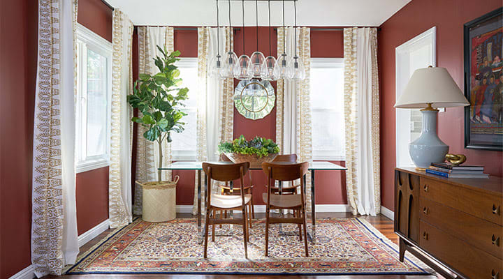
Flavoring the 2019 color palette is Spice of Life, a deliciously rich autumnal shade from Dunn-Edwards. Redolent of cinnamon and allspice, this color is a deep red mixed with bittersweet. Putting this enticing shade on your dining room walls will give the room the feeling of a Mediterranean restaurant. Pair with: Black, gray, and white pull this color into the 21st century.
Your new favorite color
Good luck in your search for your personal palette. Paint is one of the easiest, least expensive way to dramatically change the look of a room. The 2019 trend colors give us plenty of delightful choices. You're sure to find one you love. Still, says Leatrice Eiseman, Executive Director of the Pantone Color Institute, she doesn't expect the Color of the Year to be everyone's favorite. "When you're in the world of color, you're hoping they might choose something out of their comfort zone. I love to engage people. It gets them talking about color."
